
Published by Vera, which makes product identity tags, certificates and software. Vera's own role is set out under 'Where Vera fits'.
This is for general information and is not legal advice.
9 min read
A call to action on a QR code or tap tag is a short promise: what someone gets for raising their phone. The code carries the link; the line is what persuades someone to use it.
Listen to this article
Definition
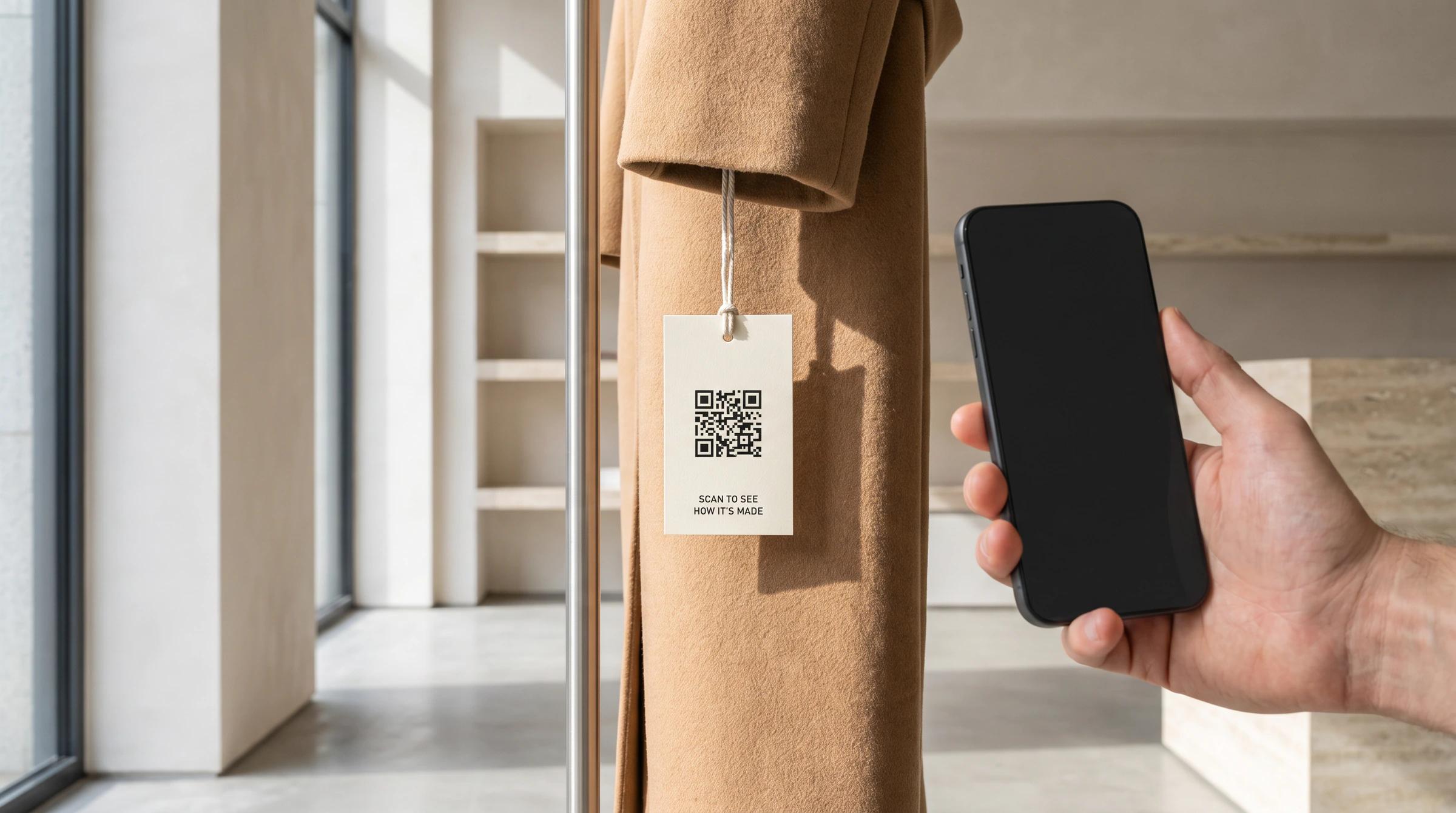
A call to action QR code is a scannable code printed with a short line that tells a person what to do and what they will get for doing it, such as "Scan to see how it's made". A tap tag works the same way, except that the person holds a phone against the product instead of pointing a camera at it.
The code itself is well defined. ISO/IEC 18004, the QR code standard, now in its fourth edition from August 2024, specifies how data is encoded in the symbol, its formats, its error correction and its print quality. It specifies the symbol, not the words around it. Those are the brand's to write, and they decide whether anyone uses the code at all.1
A tap tag adds one problem a printed code does not have. The tag is usually out of sight, inside a label or under a cap, so the call to action has a second job: showing where to tap. The NFC Forum, the body that sets the standards for near-field communication (NFC), makes the same point about its own marks: a mark that only says a technology is present is not enough, and people have to be guided to the place to tap.3
Six steps follow. They apply to a code on a hang tag, a tag in a perfume cap and a code on a wine label alike, and together they make a QR code strategy rather than a code dropped onto the artwork at the last minute.
Step 1
Raising a phone costs the person a moment and a little trust. A line that names the reward makes that trade clear before they make it. "Scan me" names nothing. "Scan for the tasting notes" names something a wine buyer may want while standing at the shelf.
Be specific about the reward, and pick one. A line that promises the story, the care guide and a discount at once promises nothing in particular. Good rewards are the ones the person cannot get from the packaging: where and how the item was made, how to care for it, proof that it is genuine, a way to register it as theirs, or what it is worth to the next owner.
The reward should also suit the moment. Before a purchase, people want to decide: what it is, where it comes from, whether it is real. After a purchase, they want to own it well: register it, care for it, and one day pass it on. A product handled in a shop and then kept for years meets both moments, so the same line has to make sense in each, or the landing page has to change with the moment.
Step 2
The call to action belongs where hands and eyes already go. Packaging is opened once and often thrown away; the product stays. A line on the outer box reaches the buyer once. A line on the product reaches every person who picks it up, including the second and third owner.
Placement also sets size and contrast. A printed code needs a flat, well-lit surface and enough size to scan from arm's length. A tap needs the mark directly over the tag, because a phone has to come close to read it. In both cases, check the spot against how the item sits on a shelf: a code on the back of a bottle that faces the wall is a code no one sees.
Cycle
A line on the product meets every moment and every owner
Before a purchase
Decide: what it is, where it comes from, whether it is real.
After a purchase
Own it well: register it, care for it.
Passed on
What it is worth to the next owner, who picks it up and meets the same line.
A loop of three moments around one call to action on the product. Before a purchase, people want to decide: what it is, where it comes from and whether it is real. After a purchase, they want to own it well: register it and care for it. One day it is passed on, and what it is worth to the next owner matters; the next owner picks it up and meets the same line, because it is on the product rather than the box, and the loop returns to deciding. The same line has to make sense at each stage, or the landing page has to change with the moment.
Step 3
Start with the action, then the reward: "Tap to see its story", "Scan to register your bottle". Two to six words is usually enough. The verb tells people what to do with the phone, and the rest of the line tells them why.
Match the verb to the technology. Say "Scan" for a printed code and "Tap" for a tag; "Tap or scan" works where both are offered. Write for people who have never heard of the technology. "NFC enabled" tells most shoppers nothing, while "Tap your phone here" tells them exactly what to do. Keep the line in the brand's voice, in the language of the market, and close enough to the mark that the two read as one instruction.
Comparison
Weak and strong calls to action, side by side
Weaker
Perfume, on the cap
Scan me
Wine, on the back label
Learn more
A garment's care label
NFC enabled
Stronger
Perfume, on the cap
Tap the cap for its story
Wine, on the back label
Scan for this bottle's tasting notes
A garment's care label
Tap here to register your jacket
What changed
Perfume, on the cap
It names the reward and the spot to tap
Wine, on the back label
It names a reward the label cannot give
A garment's care label
It says what to do in plain words, and what the owner gets
A comparison of weaker and stronger calls to action, written as illustrations. On a perfume cap, the weaker line is "Scan me" and the stronger is "Tap the cap for its story", which names the reward and the spot to tap. On a wine back label, the weaker line is "Learn more" and the stronger is "Scan for this bottle's tasting notes", which names a reward the label cannot give. On a garment's care label, the weaker line is "NFC enabled" and the stronger is "Tap here to register your jacket", which says what to do in plain words and what the owner gets.
Step 4
A printed QR code is its own signal: people recognize the square pattern and know to point a camera at it. A tag is invisible, so it needs a mark. The NFC Forum's N-Mark guidelines say the mark should be used to show the location of an item's NFC touchpoint whenever possible, which means on the spot to tap, not anywhere on the pack.2
The Forum's newer Wayfinding Mark system goes further. It is meant to show that an item includes NFC and, more important, where to tap. Its Directional variation gives the clearest guidance and is aimed at tags and devices people use only now and then; its Instructional variation spells out the tap for people with little knowledge of the technology; its Simplified variation suits people who already know what to do. The Wayfinding Marks are licensed at no charge to members and non-members, and the original N-Mark is still licensed for markets where it is established.3
A brand can also use its own symbol, as long as it sits exactly over the tag and appears the same way on every product, so that people learn it. Whatever the mark, put the words beside it.
Step 5
The page the code opens is the second half of the call to action. If the line says "see its story", the page should open on the story, not on the home page or a newsletter form. Every extra step between the tap and the promised thing is a chance for the person to give up.
It should open fast on a phone. Google's guidance for web pages is that the largest element on the page should appear within 2.5 seconds, measured at the 75th percentile of page loads and separately for mobile and desktop. A product page reached from a shop floor or a cellar may be on a weak connection, so a light page matters more here than on a desk.4
It should need no app. A line that says "Tap to see its story" and then asks for a download asks for far more than it promised. A page that opens in the phone's own browser keeps the trade the person agreed to. Then offer one clear next action on the page, such as register, save or share, rather than a menu of everything the brand does.
Last, plan for the page to outlive the campaign. A code printed on a product points to an address for as long as the product exists. Point it at an address the brand controls and can redirect, so a site redesign years later does not leave every bottle or garment opening an error page.
Step 6
Test on real products, in real places, with people who did not write the copy. The checklist below covers the common failures.
Where Vera fits
Vera's own flow runs through the same steps. The mark comes first: a fabric label can carry the Vera symbol to show where to tap, a fabric patch sits where a maker's mark would and tells the owner exactly where to tap, and a brand can put its own design on the tag face. The tag goes where the product is handled, in a form made for it: a closure tag under a perfume cap or over a wine cork, or a label sewn into a garment's seam beside the care label.
The tap opens the phone's own browser, with no app to install, and the page it opens is that item's own certificate, not a page about the product line. The certificate takes the brand's logo and colors and can open on the brand's own domain. Each tap produces a fresh code, so a copied or screenshotted link is recorded as an invalid scan rather than shown as verified. A printed code is the same on every unit; this one changes with every tap.
It works before the sale and after it. Tags can be bound to their products before a box leaves the factory, so the certificate exists when a shopper first picks the item up. Someone who taps and leaves their details becomes a named lead, credited to the owner whose item they tapped. When the item is sold on, the certificate goes with it, and every transfer, scan and resale is written to the same record.
Process
From the mark to the action, in Vera's tap-to-certificate flow
The mark
The Vera symbol, or the brand's own design, shows where to tap.
The tap
It opens the phone's own browser, with no app to install.
The landing
That item's own certificate, in the brand's logo and colors, with a fresh code on every tap.
The action
A shopper leaves their details; an owner keeps the record, and it goes with the item when it is sold on.
A four-step process. First, the mark: the Vera symbol, or the brand's own design, shows where to tap. Second, the tap opens the phone's own browser, with no app to install. Third, the landing page is that item's own certificate, in the brand's logo and colors, with a fresh code on every tap. Fourth, the action: a shopper can leave their details, and an owner keeps the record, which goes with the item when it is sold on.
Published by Vera, which makes product identity tags, certificates and software. Vera's own role is set out under 'Where Vera fits'.
This is for general information and is not legal advice.
Questions
Explainer, 7 min read

Perspective, 5 min read

Perspective, 4 min read